
Developer Tools
CSS Gradient Generator
Visually create beautiful CSS gradients. Supports linear, radial, angles, and multiple color stops.
A visual CSS box-shadow generator for web developers and designers. Easily design complex drop shadows or inset shadows by adjusting X/Y offsets, blur radius, spread radius, and shadow color with opacity. See the results instantly and copy the cross-browser CSS code.
box-shadow: 10px 10px 20px 0px rgba(0,0,0,0.25);
The CSS Box Shadow Generator is a visual sandbox for creating shadow effects without writing CSS manually. It provides intuitive sliders for all shadow properties (offset, blur, spread, opacity) and outputs the exact CSS code instantly.
The box-shadow CSS property adds shadow effects around an element's frame. You can specify multiple effects separated by commas, creating everything from simple drop shadows to complex glowing effects.
By default, shadows drop outside the element. An inset shadow (using the inset keyword) draws the shadow inside the frame, making the element look pressed in or stamped.
The blur radius makes the shadow larger and lighter, softening the edges. The spread radius expands (positive value) or shrinks (negative value) the shadow's base size before it is blurred.
The X offset moves the shadow horizontally (positive values move it right, negative left). The Y offset moves the shadow vertically (positive values move it down, negative up).
RGBA allows you to set an opacity (Alpha) for the shadow. A semi-transparent black shadow (like rgba(0,0,0, 0.5)) blends beautifully with whatever background color sits behind the element.
Yes! CSS allows you to comma-separate multiple shadows. You can combine an inset shadow and an outer drop shadow on the exact same element to create complex 3D effects.
No. A box shadow is drawn entirely outside (or inside) the element's box model. It does not push other elements around or change the physical width and height.
box-shadow applies a rectangular shadow around the element's border box. filter: drop-shadow() applies a shadow conforming to the actual shape of the element's contents (like a transparent PNG image).
Yes, box-shadows are fully animatable in CSS. You can transition the offset, blur, spread, or color on a :hover state to make a button look like it is floating or being pressed.
Generally, no. However, massive blur radii or animating complex shadows on many elements simultaneously can cause performance drops on lower-end mobile devices due to the rendering calculations.
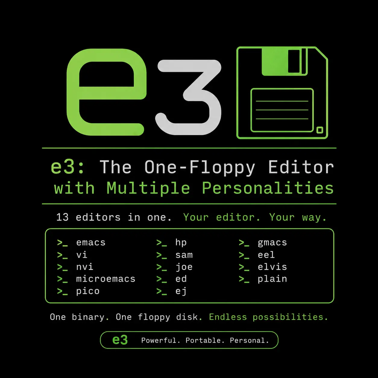
A DevOps guide to compiling and deploying e3, the microscopic assembly-written Linux editor that mimics Vim, Emacs, Nano, WordStar, and Nedit.

A comprehensive guide to building real-world AI projects in 2026. Learn to deploy local LLMs, build RAG pipelines, manage MLOps, and secure your self-hosted infrastructure.

Find out if your password was leaked in a data breach. Learn to audit credentials with HaveIBeenPwned, k-Anonymity hashing, and secure compromised accounts.
Explore our full collection of free, privacy-first developer and SEO tools.
Browse All 134+ ToolsStart typing to search across articles, tools & courses