
Developer Tools
CSS Box Shadow Generator
Visually generate CSS box-shadows. Adjust offset, blur, spread, and opacity in real-time.
Generate production-ready CSS text shadows effortlessly with real-time visual feedback. Adjust horizontal (X) and vertical (Y) offsets, blur radius, color, and opacity using intuitive controls. Perfect for web designers and front-end developers building hero sections, high-contrast headings, retro 3D lettering, and subtle typographic depth. Copy multi-browser CSS snippets with a single click.
text-shadow: 4px 4px 5px rgba(0,0,0,0.5);
The FreeTechLearner CSS Text Shadow Generator provides an intuitive visual interface to build, test, and preview custom text shadow styles in real time. It eliminates manual trial-and-error in code editors by allowing you to dynamically tune X/Y positioning, blur softness, color palettes, and transparency levels with instant visual feedback.
The CSS text-shadow property accepts offset-x, offset-y, blur-radius, and color in the format: text-shadow: [offset-x] [offset-y] [blur-radius] [color];. For example: text-shadow: 4px 4px 5px rgba(0, 0, 0, 0.5);.
The horizontal offset (X) shifts the shadow right (positive values) or left (negative values). The vertical offset (Y) shifts the shadow down (positive values) or up (negative values).
Yes! You can chain multiple text shadows by separating them with commas. For example: text-shadow: 2px 2px 4px #000, -2px -2px 4px #fff;. This technique is commonly used to create complex 3D lettering, outline text, and multi-layered neon glows.
To create a neon glow, set both X and Y offsets to 0px, choose a bright neon color (like cyan or magenta), and set a large blur-radius (e.g., text-shadow: 0 0 10px #00f3ff, 0 0 20px #00f3ff;).
The text-shadow property applies drop shadows specifically to text glyphs and font characters inside an element. In contrast, box-shadow applies a drop shadow to the outer box boundary (border box) of an HTML container block.
CSS text-shadow is standard CSS rendered natively by browser graphics hardware, so it has zero negative impact on SEO and minimal GPU cost. However, applying dozens of heavily blurred multi-layered shadows on long body text paragraphs may slow down page scrolling on low-end mobile devices.
Placing white text on complex, bright, or varying background images often causes WCAG contrast issues. Adding a subtle dark text shadow (e.g., 0 2px 4px rgba(0,0,0,0.7)) creates immediate separation between the text and background, drastically improving readability for visually impaired users.
Yes! The text-shadow property has 100% full browser support across Chrome, Firefox, Safari, Edge, Opera, iOS Safari, and Android Chrome. No browser vendor prefixes are needed.
Discover SLED, the minimalist terminal line editor that is faster than Nano, boasts a tiny footprint, and has virtually zero learning curve.
Learn everything about Nano, the easy terminal text editor in Linux. Master basic navigation, search, replace, and complete editor configurations.
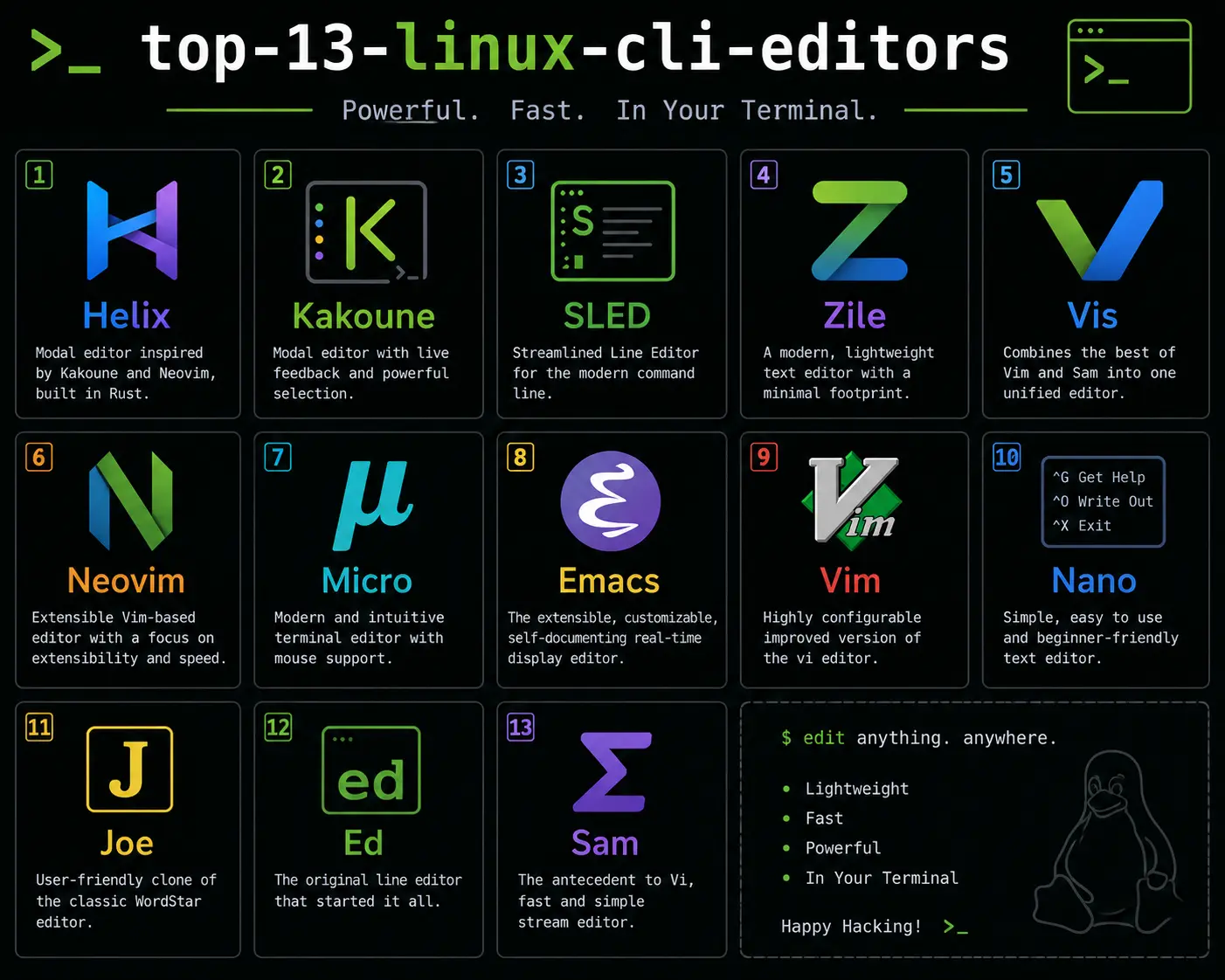
An honest comparison of 13 Linux CLI text editors — Vim, Nano, Emacs, Neovim, Helix, Micro, Kakoune, and more. Features, trade-offs, and real recommendations.
Explore our full collection of free, privacy-first developer and SEO tools.
Browse All 134+ ToolsStart typing to search across articles, tools & courses