
Developer Tools
CSS Box Shadow Generator
Visually generate CSS box-shadows. Adjust offset, blur, spread, and opacity in real-time.
Master modern CSS shape generation with our advanced 8-value border-radius generator. Effortlessly create custom rounded corners, organic fluid blobs, pill buttons, speech bubbles, and distinctive UI container cards. Independently tune all 8 corner values (horizontal and vertical radii), customize border stroke styles, and copy clean, cross-browser CSS code with one click.
border-radius: 50% 50% 50% 50% / 50% 50% 50% 50%;
border: 2px solid #3b82f6;
The FreeTechLearner 8-Point CSS Border Radius Generator provides an interactive visual canvas to craft custom geometric and organic shapes. It enables web developers to visually tweak all 8 radius parameters (4 horizontal corners + 4 vertical corners), stroke weights, border styles, and colors with real-time feedback, automatically outputting clean, production-ready CSS.
The 8-point border-radius syntax uses a slash (/) to separate horizontal radii from vertical radii: border-radius: [top-left-x] [top-right-x] [bottom-right-x] [bottom-left-x] / [top-left-y] [top-right-y] [bottom-right-y] [bottom-left-y];. For example: border-radius: 60% 40% 30% 70% / 60% 30% 70% 40%;.
By specifying asymmetric horizontal and vertical radii for each of the four corners, the curvature along the horizontal axis differs from the vertical axis. When combined, this produces fluid, organic, non-rectangular blob shapes popular in modern web design.
Yes! Pixel values (px) produce fixed, absolute corner radii that stay constant regardless of element dimensions. Percentage values (%) calculate radii relative to the width and height of the element, making shapes responsive.
To make a perfect circle, set border-radius: 50% on a square element (equal width and height). If the element is rectangular, border-radius: 50% creates an oval or ellipse.
To create a pill button, set border-radius: 9999px or border-radius: 50px (a value larger than half the height of the button). This ensures smooth, fully rounded left and right ends regardless of button text length.
Yes, if you set overflow: hidden; on the container element. By default, background colors and background images are clipped to the border-radius curve, but child elements might overflow unless overflow: hidden; is applied.
Yes! The border-radius property has 100% full native support across Chrome, Firefox, Safari, Edge, Opera, iOS Safari, and Android. Vendor prefixes (like -webkit-border-radius) are no longer needed.
Shorthand border-radius allows setting all corners in a single declaration. Alternatively, you can target specific corners individually using border-top-left-radius, border-top-right-radius, border-bottom-right-radius, and border-bottom-left-radius.

A DevOps guide to GNU Emacs. Discover the Lisp machine disguised as a text editor. Learn keyboard chords, buffers, Org mode, Magit, and Evil mode integration.
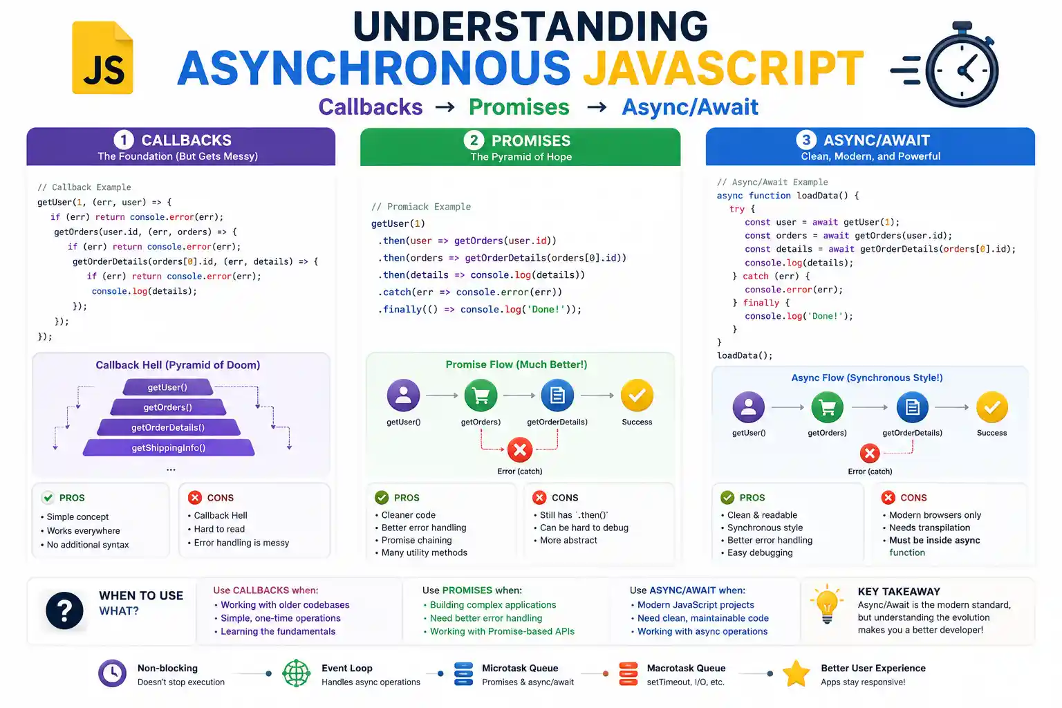
A complete beginner's guide to asynchronous JavaScript. Learn the evolution from Callbacks to Promises to Async/Await with real-world examples.

Master Voice Search Optimization (VSO) in 2026. Architectural guide on conversational NLP, Schema speakable markup, Position Zero snippets, and local entity search.
Explore our full collection of free, privacy-first developer and SEO tools.
Browse All 134+ ToolsStart typing to search across articles, tools & courses