

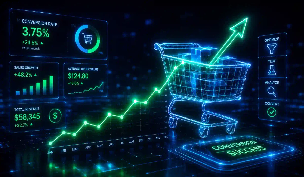
Imagine for a moment that you own a physical retail store in a busy shopping mall. Every day, 1,000 people walk through your front doors. They browse the aisles, they look at the price tags, they pick up the products, and then 990 of them turn around and walk right back out without buying a single thing. Only 10 people make a purchase.
In the physical world, a 1% conversion rate would induce panic. You would immediately close the store and investigate why 99% of your customers are leaving empty-handed. Is the store too dark? Is the checkout line too confusing? Are the sales associates rude?
Yet, in the digital business world, a 1% conversion rate is routinely accepted as “normal.” E-commerce companies and SaaS startups will willingly spend tens of thousands of dollars a month on Search Engine Optimization (SEO) and PPC Advertising just to double their traffic to 2,000 visitors a day, solely to get 10 more sales.
This is financial insanity. There is a cheaper, smarter, and more profitable way to grow your business: You must fix the holes in the bucket before you pour more water into it.
Welcome to the definitive guide on Conversion Rate Optimization (CRO). In this guide, we will abandon traditional marketing fluff. Instead, we will enter the rigorous realm of behavioral psychology, data science, A/B testing, and heuristic formulas to prove how you can double your revenue without increasing your web traffic by a single visitor.
1. What is Conversion Rate Optimization (CRO)?
Conversion Rate Optimization (CRO) is the systematic, data-driven process of increasing the percentage of website visitors who take a specific, desired action—whether that action is purchasing a product, filling out a lead generation form, or subscribing to an email newsletter.
The CRO process involves analyzing how users navigate through your site, identifying where they get confused or frustrated, and redesigning those touchpoints to remove friction.
The Compounding Math of CRO
To understand why CRO is one of the most lucrative activities a marketing team can engage in, you must look at the math.
Assume your website gets 10,000 visitors a month, your conversion rate is 2%, and your software product costs $100:
- You make 200 sales.
- Your monthly revenue is $20,000.
If you spend three months optimizing your website’s checkout flow and increase the conversion rate to 4%:
- You now make 400 sales from the same 10,000 visitors.
- Your monthly revenue is $40,000.
You just doubled your company’s revenue without spending an extra dollar on Google Ads or Facebook Marketing. Furthermore, because your conversion rate is now double that of your competitors, you can afford to bid twice as much as them on ad networks, pushing them out of the market. That is the compounding magic of CRO.
2. Deconstructing the Funnel: Micro vs. Macro Conversions
A conversion is rarely a singular event. A user does not usually go from “First time hearing about your brand” to “Typing in a credit card for a $1,000 purchase” in a single click. They take a series of smaller, calculated steps.
Macro-Conversions (The Ultimate Goal)
The macro-conversion is the primary objective of the website. It is the action that directly impacts the bottom line.
- An e-commerce store: Completing the checkout process and buying a product.
- A SaaS company: Upgrading from the free tier to a paid monthly subscription.
- A B2B Consultant: Booking a qualified sales consultation call.
Micro-Conversions (The Stepping Stones)
Micro-conversions are the smaller, incremental actions a user takes that indicate intent and move them closer to the macro-conversion.
- Adding a product to the shopping cart.
- Downloading a free PDF Lead Magnet.
- Subscribing to an email newsletter.
- Watching a 3-minute product explainer video to completion.
The Golden Rule of Funnel Optimization: If your Macro-Conversion rate is low, you cannot fix it by simply changing the color of the final “Buy” button. You must analyze the funnel backwards and optimize the Micro-Conversions first. You cannot get someone to buy the product if you can’t even get them to add the item to their cart.
3. The CRO Formula: The Psychology of a Conversion
To optimize a webpage, you must understand the psychological equation occurring inside the user’s brain. The most widely accepted framework in the CRO industry is the MECLABS Heuristic Formula:
C = 4M + 3V + 2(i-f) - 2A
Do not let the algebra intimidate you. It is simply a framework to weigh the psychological forces at play. Here is what it means:
- C (Probability of Conversion): The likelihood that the user will take the desired action. This is determined by the following factors:
- M (Motivation) - Weight 4x: How badly does the user actually want or need the product? (Crucially, you cannot control Motivation on the webpage itself; this is driven by how well your external marketing targeted the right audience).
- V (Value Proposition) - Weight 3x: Is the benefit of your product clear? Does the user understand why you are better than the competitor?
- I (Incentive) - Weight 2x: Is there an urgent reason to buy right now? (e.g., A limited-time discount, free shipping, or a bonus gift).
- F (Friction) - Weight 2x (Negative): How difficult is the process? Friction is anything that causes the user to think or exert effort. A slow-loading page, a form with 15 mandatory fields, or confusing navigation all generate friction.
- A (Anxiety) - Weight 2x (Negative): Does the user feel safe? Anxiety spikes the moment you ask for an email address or a credit card. “Is this a scam? Will they spam my inbox? What if I hate the product and want a refund?”
The CRO Mandate: To increase Conversions (C), your webpage must amplify the Value Proposition (V) and Incentive (I), while identifying and removing Friction (F) and Anxiety (A).
4. The Scientific Method of A/B Testing
True Conversion Rate Optimization is not guessing. It is not asking the CEO what color they prefer. It is not copying a competitor’s website because “it looks cool.” It is the rigorous application of the scientific method to digital commerce.
The core mechanism of CRO is A/B Testing (or Split Testing). You use software (like Google Optimize, VWO, or Optimizely) to create two distinct versions of a webpage:
- Version A (The Control): The original, current page.
- Version B (The Variant): The same page, but with ONE specific variable changed (e.g., a new headline).
The testing software automatically routes 50% of your incoming traffic to Version A, and 50% to Version B, and mathematically measures which version generates more sales.
Step 1: Hypothesis Generation
You must never test random elements. You must formulate a data-backed hypothesis.
- Bad Hypothesis: “I think a green button will look nicer than a red button, let’s test it.”
- Good Hypothesis: “Data shows 60% of mobile users drop off at the shipping form. I hypothesize that removing the mandatory ‘Company Name’ and ‘Address Line 2’ fields will reduce Friction, thereby increasing completed mobile checkouts by 5%.”
Step 2: Statistical Significance (The Math of Certainty)
If Version B gets 10 conversions and Version A gets 8 conversions, Version B is the winner and you should redesign the whole site, right? Wrong.
In statistics, that small of a sample size is meaningless. It is statistical noise. It could just be random luck that 10 buyers happened to land on Version B today. You must run the A/B test until you achieve 95% Statistical Significance. This is a mathematical threshold proving that the increase in conversion rate was caused by your design change, and not by random chance.
Crucial Caveat: If your website gets less than 1,000 visitors a month, you mathematically do not have enough traffic to run rigorous A/B tests; they would take 8 months to reach significance. Low-traffic sites should focus on user interviews and implementing universal UX best practices instead of A/B testing.
5. The 4 Essential Tools for the CRO Analyst
To form a solid hypothesis, you need data. You need both Quantitative data (the absolute numbers of what is happening) and Qualitative data (the human element of why it is happening).
1. Google Analytics 4 (Quantitative Data)
Google Analytics is the bedrock of CRO. It tells you the mathematical reality of your funnel.
- Funnel Exploration: Where are users dropping off? Do 100% of people view the product, but only 5% click “Add to Cart”? The problem is the product page.
- Device Segmentation: Are desktop users converting at a healthy 4%, but mobile users are converting at an abysmal 0.2%? Your mobile user experience is fundamentally broken.
2. Heatmaps & Scrollmaps (Qualitative Data)
Tools like Hotjar, CrazyEgg, or Microsoft Clarity visually map user behavior.
- Heatmaps: Show you where people are clicking or tapping. Are they repeatedly clicking on an image that isn’t actually a hyperlink? That causes frustration and friction.
- Scrollmaps: Show you how far down the page users scroll before leaving. If your critical “Buy Now” button or your best customer testimonials are at the bottom of the page, and the scrollmap reveals that only 10% of users scroll that far, you have identified why conversions are low.
3. Session Recordings
These tools record anonymized video playbacks of actual users navigating your site. Watching a user move their mouse, repeatedly try to click a broken dropdown menu, or abandon a form halfway through is an effective way to spot UX friction.
4. User Testing (Voice of Customer)
Sometimes, data isn’t enough. You need to ask humans. Platforms like UserTesting.com allow you to hire random people in your target demographic to navigate your website while speaking their thoughts out loud. Hearing a user say, “I don’t understand what this pricing tier means,” provides actionable feedback that no heatmap could ever tell you.
6. Eliminating Friction and Anxiety
Friction and Anxiety are the two heaviest negative weights in the MECLABS formula. Humans can be hesitant online. If your website makes them think too hard, or makes them feel unsafe, they will leave.
Destroying Friction
- Mandatory Account Creation: Forcing a user to create a password, verify their email, and set up an account before they can buy a $15 t-shirt will hurt your conversion rate. Always prominently offer a frictionless “Guest Checkout” option.
- Form Field Bloat: Do you genuinely need a user’s fax number, middle initial, and company size just to let them download a PDF eBook? Every single input field you add to a form drastically lowers the conversion rate. Ask only for the minimum data required (usually just an Email Address and First Name).
- Site Latency: Amazon famously conducted a study proving that every 100 milliseconds of page latency cost them 1% in overall sales. A slow-loading website adds unnecessary friction. Optimize your images, minify your JavaScript, and use a Content Delivery Network (CDN).
Destroying Anxiety
Anxiety spikes the moment the user reaches the checkout page. They are worried about fraud, spam, and buyer’s remorse.
- Trust Badges: Place recognizable logos near the credit card field. A simple “Secured by Stripe” or “Norton Secured” badge subdues subconscious fears of credit card theft.
- Risk Reversal: State the guarantee next to the “Buy” button. “30-Day, No-Questions-Asked Money-Back Guarantee. If you aren’t satisfied, we refund you within 24 hours.” If the user feels there is no risk, they will convert.
7. Psychological Triggers: Social Proof and Urgency
Once you have smoothed out the friction and eliminated the anxiety, you can use psychological triggers to compel the user to act now rather than “later.”
Social Proof (The Bandwagon Effect)
Humans are tribal creatures. If we are unsure of what to do, we look to see what other people are doing. If you are at a food court, and one restaurant has a long line of people, while the other is empty, you assume the busy restaurant has better food.
- Testimonials: Never use text-only quotes; they look fake. Always include a high-quality photo of the customer, their full name, and their company title.
- Authority Logos: A banner stating “Trusted by teams at [Google, Microsoft, Amazon]” validates your software.
- Volume Metrics: “Join 50,000 other marketers receiving our weekly newsletter” provides social proof.
Scarcity and Urgency (FOMO)
Humans are afraid of missing out on a good deal (Fear Of Missing Out).
- Scarcity (Limited Supply): “Only 2 items left in stock!” (CRITICAL NOTE: Only use scarcity if it is mathematically true. If you use fake scarcity plugins on a digital product, consumers will realize you are lying, and you will destroy their trust).
- Urgency (Limited Time): “Flash sale ends in 4 hours.” Using visual countdown timers drives action.
8. The Anatomy of a Landing Page
If you are spending money on PPC ads, you must never send that traffic to your generic homepage. Homepages are designed for exploration; they have dozens of links. If you give a user 20 options, they will take none of them (Analysis Paralysis). You must send ad traffic to a dedicated Landing Page.
A High-Converting Landing Page Must Have:
- Message Match: The headline on the landing page must match the text of the ad they just clicked. If the ad says “Free SEO Audit,” the landing page headline must say “Get Your Free SEO Audit.”
- The Hero Section (Above the Fold): Before the user scrolls, they must see a clear headline, a sub-headline explaining the specific value proposition, and a prominent Call-To-Action (CTA) button.
- No Navigation Bar: A landing page is designed to focus the user. You do not want them clicking away to your “About Us” page, your “Blog,” or your social media links. The navigation bar must be removed. They only have two options: Convert, or close the browser tab.
- Benefit-Driven Bullets: Do not list technical features. List benefits. Do not say “1 Terabyte of Storage.” Say “Store 500,000 photos of your family securely.”
- Proximity of Trust: Place your 5-star reviews and your 30-day guarantee adjacent to the final checkout button.
9. Mobile Optimization: The Silent Revenue Killer
In 2026, over 60% of all global web traffic originates from mobile devices. Yet, web developers and designers continue to build and test websites on 27-inch desktop monitors in their offices.
A website that looks beautiful on a desktop often becomes a conversion nightmare on a smartphone.
- The “Fat Finger” Test: Are your buttons large enough to be easily tapped with a thumb? If two text links are placed too close together, a mobile user will accidentally click the wrong one, become frustrated, and leave.
- The Mobile Fold: On a smartphone screen, is your primary CTA button visible immediately when the page loads? Or does the user have to scroll past a vertically-stacked hero image just to find out what the product costs?
- Sticky CTAs: The best mobile design practice is to pin a “Buy Now” or “Add to Cart” button to the bottom of the mobile screen. No matter how far down the user scrolls to read reviews or features, the ability to convert is always within reach.
Frequently Asked Questions (FAQ)
What is Conversion Rate Optimization (CRO)?
Conversion Rate Optimization (CRO) is the data-driven process of increasing the percentage of website visitors who take a specific desired action, such as making a purchase, filling out a lead form, or subscribing to a newsletter.
What is the difference between macro and micro conversions?
Macro-conversions are primary business goals like completing a purchase or booking a consultation. Micro-conversions are smaller stepping stones that indicate user intent, such as adding a product to a cart or watching an explainer video.
How does the MECLABS Heuristic Formula work?
The MECLABS formula evaluates the probability of a conversion by weighing psychological forces: it amplifies Motivation, Value Proposition, and Incentive (positive forces), while identifying and reducing Friction and Anxiety (negative forces).
Why is Statistical Significance important in A/B testing?
Statistical Significance mathematically proves that the difference in conversion rates between a control page and a variant is caused by the design change, rather than just random chance or a small sample size.
How can I reduce anxiety for users on my checkout page?
You can reduce anxiety by adding trust badges (like “Secured by Stripe”), clearly stating robust risk-reversal guarantees (such as a 30-day money-back guarantee), and displaying authentic social proof from satisfied customers.
Conclusion
Conversion Rate Optimization is not a one-time project you do before launching a website. It is a permanent operational philosophy. It is the acknowledgement that your website is never truly “finished,” and that your assumptions about what customers want are usually wrong.
By replacing executive guesswork with rigorous A/B testing, watching how real people interact with your site, amplifying your value proposition, and removing the friction that stops them from buying, you build a digital sales engine that becomes more efficient and profitable over time. Stop buying more traffic, and start fixing your bucket.

Discussion
Loading comments...